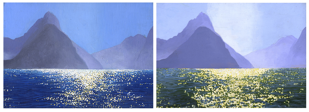
These two sketches helped me choose colours and lines to emphasize in my painting Milford Sound. The first sketch uses a bright blue on top of a dark blue to show the sea. The second sketch uses a bright blue on top of a dulled green to show the colours of the sea. The sky in the second is lighter to emphasize the line of the mountain that falls to the sea.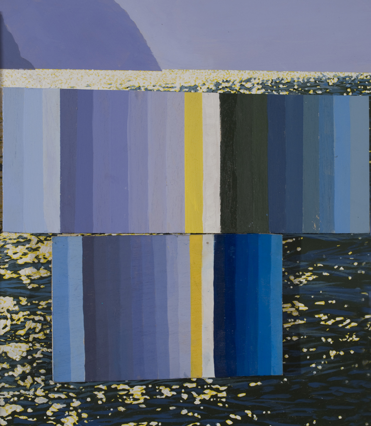
The top colour chart is for the second sketch which became the colours of my painting Milford Sound.
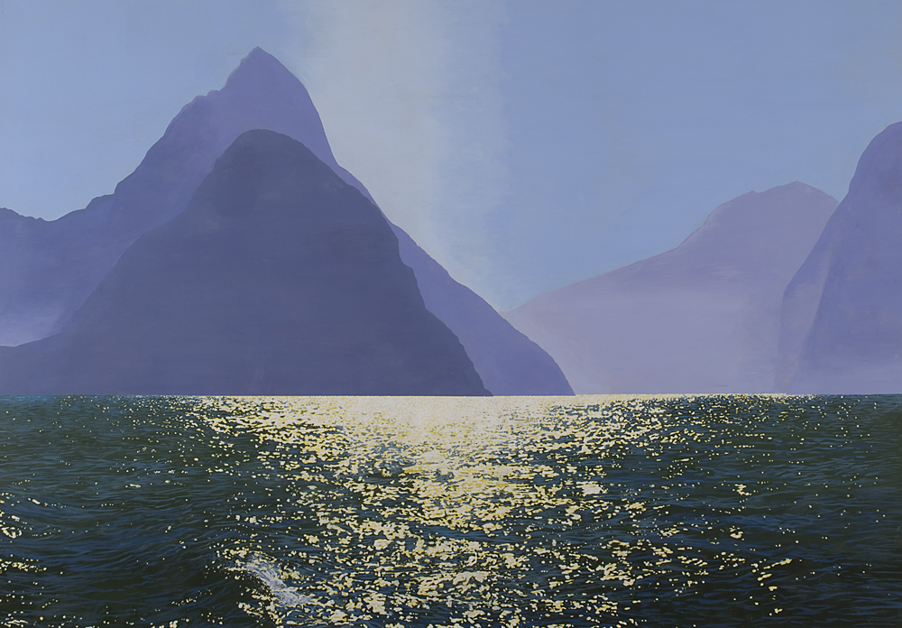
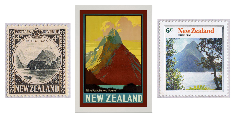
Mitre Peak is a mountain in the sound that is a very strong national symbol. I was more interested in the meeting of mountain and sea than that icon. I removed photographic details of that mountain to emphasize that relationship.

